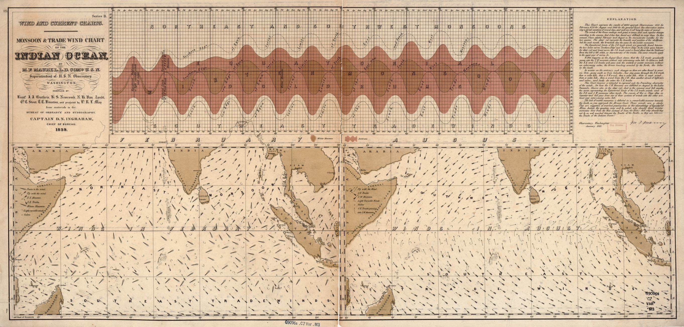
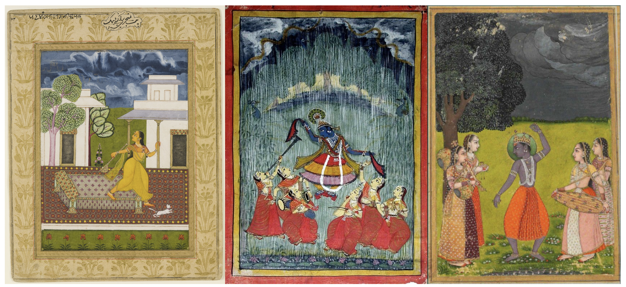
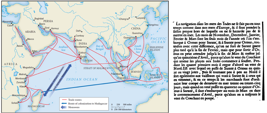
Asian monsoons
Indentifying key paleogeographic controls
Description

This image can also have a caption. It's like magic.

This image can also have a caption. It's like magic.

This image can also have a caption. It's like magic.
Related publications
You can also put regular text between your rows of images. Say you wanted to write a little bit about your project before you posted the rest of the images. You describe how you toiled, sweated, bled for your project, and then… you reveal it’s glory in the next row of images.


You can also have artistically styled 2/3 + 1/3 images, like these.
The code is simple.
Just wrap your images with <div class="col-sm"> and place them inside <div class="row"> (read more about the Bootstrap Grid system).
To make images responsive, add img-fluid class to each; for rounded corners and shadows use rounded and z-depth-1 classes.
Here’s the code for the last row of images above:
<div class="row justify-content-sm-center">
    <div class="col-sm-8 mt-3 mt-md-0">
        <img class="img-fluid rounded z-depth-1" src="/assets/img/6.jpg" alt="" title="example image"/>
    </div>
    <div class="col-sm-4 mt-3 mt-md-0">
        <img class="img-fluid rounded z-depth-1" src="/assets/img/11.jpg" alt="" title="example image"/>
    </div>
</div>